A creative solution for a multifaceted craftsman
Design and Goal
Crafting a holistic depitction of this client
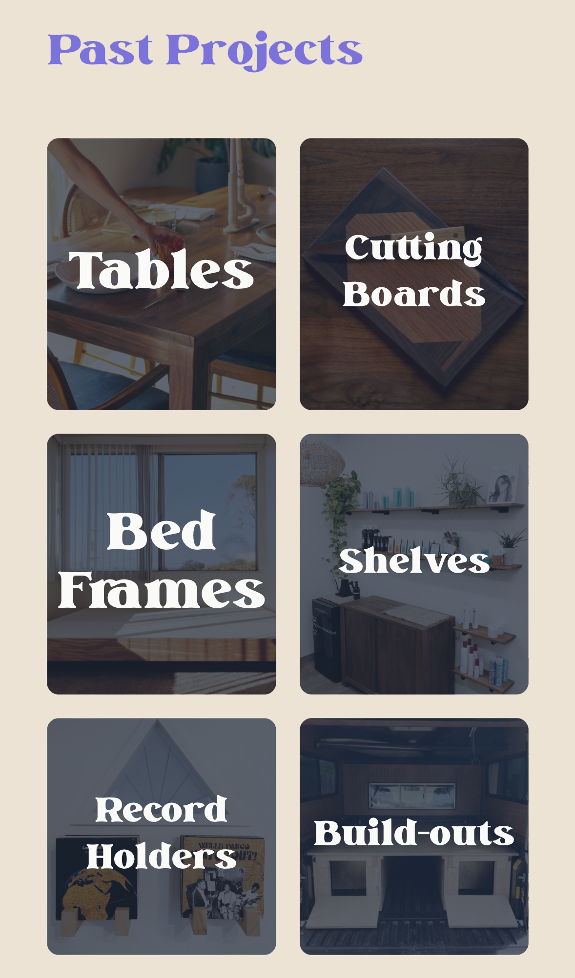
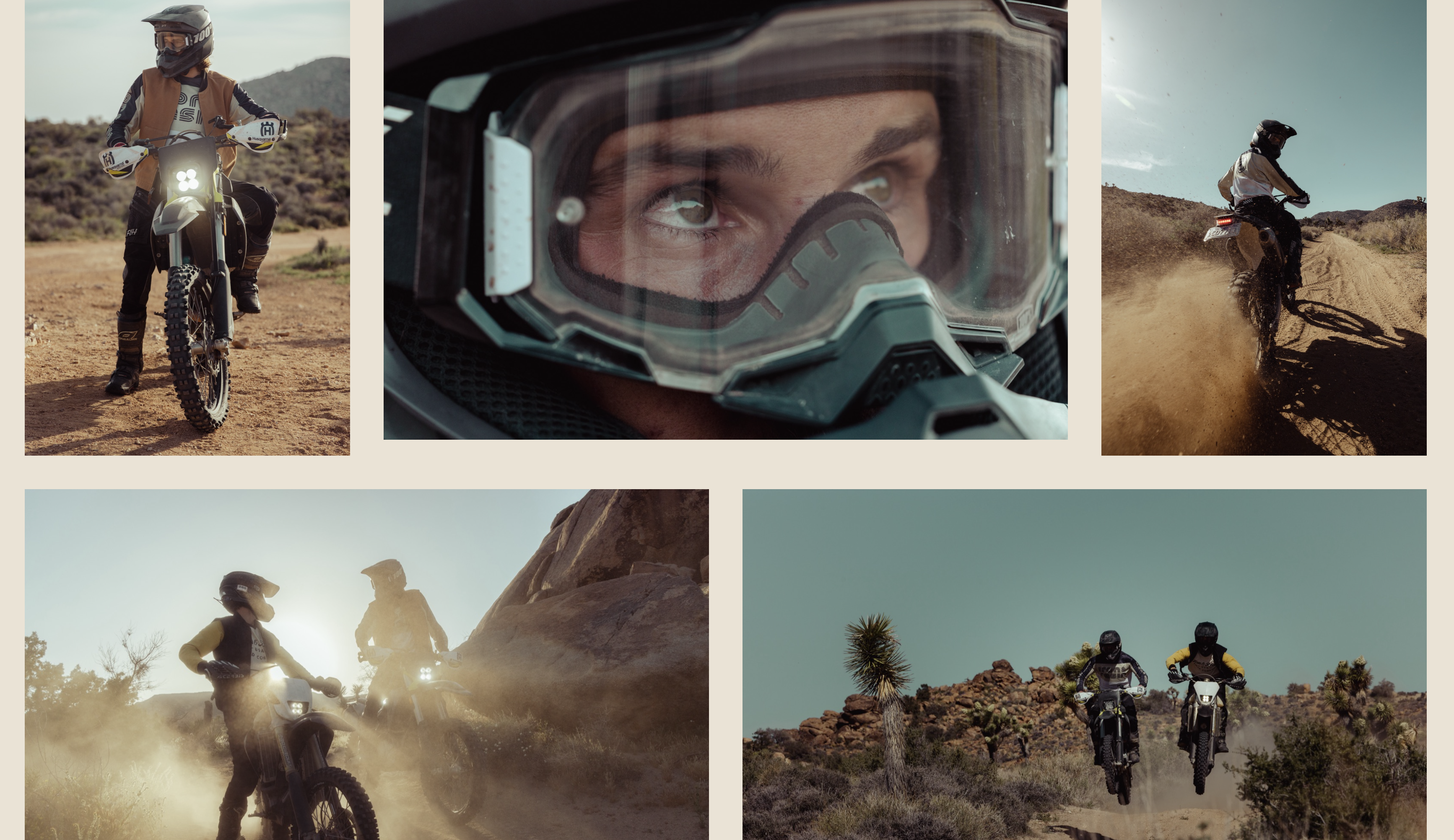
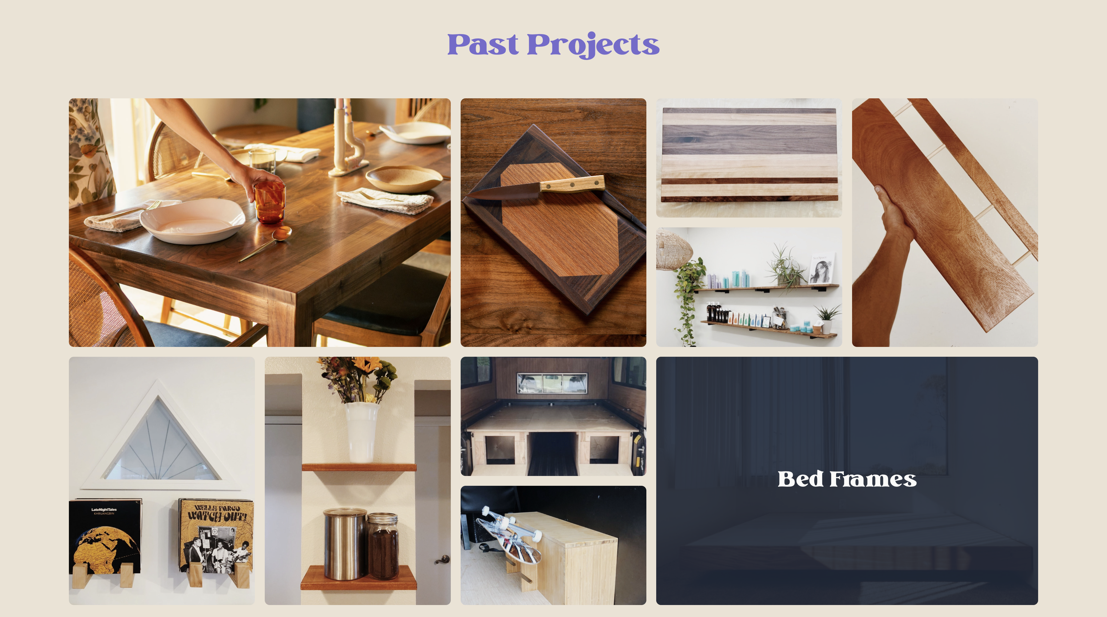
Broken into three distinct sections, the site is designed to provide a clear picture of the client's abilities and services. The first section is a gallery of his photography, the second a overview of his past woodworking projects and the third a gallery of his on camera work. Each containing a distinct call to action to contact him for his services. The most intentional of the three sections is the craftsman tab. Considering most of his work is custom, it didnt make sense to build him a shopify storefront. Instead, I chose to implement a simple catalogue style gallery of images that when clicked, would open a modal containing aproduct description, a handful of FAQ's and a mailto link for an order CTA.
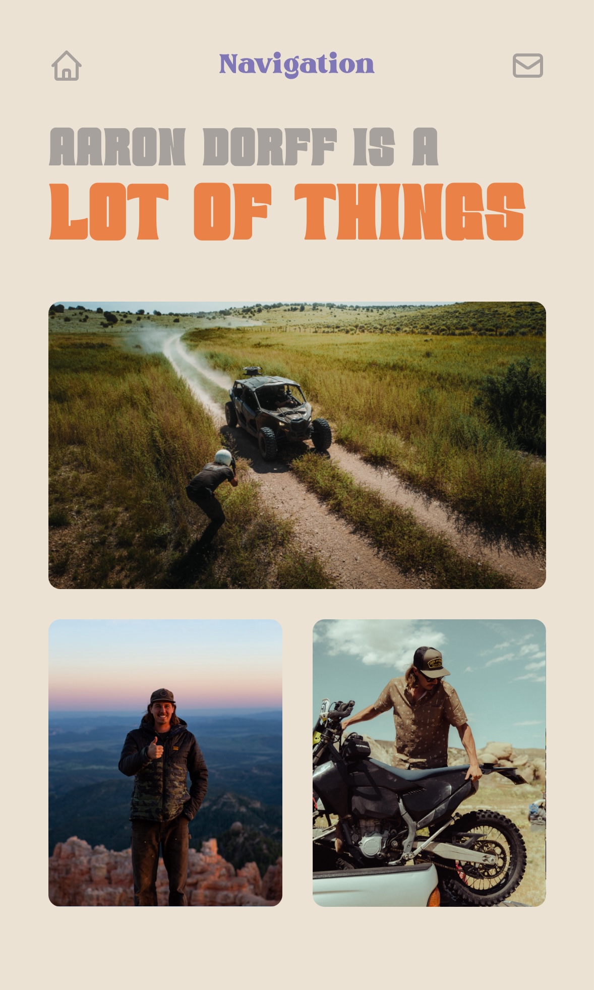
When designing the site, I wanted to make sure that the clients honest charm and scrappy work ethic were paplable. Combined with the fact that he spends most of his time in the wilderness, I made the site using a dusty color palette reminiscent of a desert sunrise. For font I used Crimbo Vintage, and Vintage Rovery to resemble the clients favorite hideaway, Pioneertown in the Southern California desert.
The final thing worth calling out was the intention behind site layout, and the integral transition animations made with framer motion. The intention was to maintain the same layout throughout the site only changing his title, and the cooresponding content. Simple, however it is an ever so slight nod to the client's steadfast charachter among his various disciplines. Designed to share a similar feel on both desktop and mobile, the site has a playful feel that is sure to please the client and his customers.